The Story
Why social context matters in clinical care
A patient's health does not exist in isolation. Income, education, employment, food security, housing, and living conditions can all influence the circumstances around health.
Health is shaped by more than the chart
Social Determinants of Health — income and social protection, education, unemployment, working conditions, food insecurity, housing, basic amenities, and environment — can influence health equity in profound ways.
This project explored how a digital product could help healthcare practitioners capture that social context without adding unnecessary administrative burden.
“How might we make complex social-health information easier for practitioners to capture, manage and communicate?”
The Practitioner Problem
This is a workflow problem, not a form problem
Capturing social context is difficult when the person responsible for collecting it is already managing a high-volume healthcare workflow.
From paper chaos to digital continuity
For practitioners like Jennifer, the friction is operational as well as informational. Paper forms can be misplaced. Legacy computer systems create friction. High patient volume increases the risk of missed appointments. Patient information and documents need to remain organised across hospital, clinic, and home contexts.
The deeper UX question became:
This became the design opportunity behind SDOH Health
The design opportunity
Meet Jennifer
Designing around a nurse's real day
Jennifer is the narrative anchor for every design decision — her workflow, not a feature list, defines what the product needs to do.
User Persona

Jennifer
35 · Nurse · New York City
Jennifer screens patients for health-related social needs and connects community and clinical services. She gathers information face-to-face or on audio calls — and needs to manage that work across hospital, clinic, and home without adding administrative burden.
“If we could understand patients’ lifestyle and surroundings, we could reduce the chronic cases that keep ending in emergency calls.”
Goals
- Easy, low-friction tool for gathering patient and social-health context
- Reminders for scheduled form-filling appointments
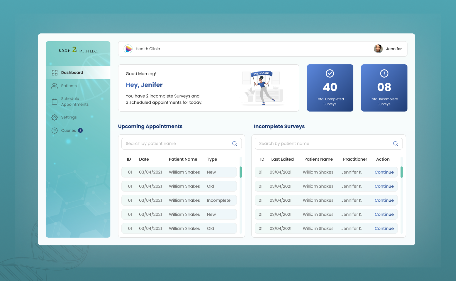
- At-a-glance metrics for completed, incomplete, and upcoming work
Motivations
- Keep patient details and documents in one place
- Work reliably across hospital, clinic, and home
Frustrations
- Forgotten appointments under heavy patient load
- Paper forms that get misplaced
- Outdated computer systems
- Too many patients to maintain in a 24-hour cycle
Jennifer is the narrative anchor for every design decision — her workflow, not a feature list, defines what the product needs to do.
“The form is not the product. The workflow around the form is the product.”
What Jennifer needs to accomplish
Design Challenge
A simple workflow for complex information
The design challenge centres on reducing fragmentation — making social-health capture feel like part of Jennifer's day, not an interruption to it.
Six principles that guided the design
Make capture straightforward
Reduce unnecessary effort during data collection.
Make progress visible
Help practitioners understand what is complete and what remains.
Keep information organised
Patient information should be easy to find and review.
Design around the workflow
Navigation should help practitioners complete work, not simply browse screens.
Support different contexts
Consider mobile, desktop/laptop, and iPad/tablet use across working environments.
Connect capture to communication
Collected information should have value beyond storage.
UX Process
Understand → Represent → Structure → Explore → Connect → Refine
The project followed a design-sprint-oriented progression — from understanding the problem through persona, structure, wireframes, prototyping, and high-fidelity UI.
Design process overview

From user research and persona through information architecture, wireframes, prototyping, and high-fidelity design — each stage builds on the last.
Six stages of progression
Understand
explore the problem and practitioner context
Represent
turn target user needs into a clear persona
Structure
define information architecture and product hierarchy
Explore
use wireframes to work through the workflow
Connect
prototype the core interactions
Refine
translate structure into high-fidelity UI
The source establishes these process stages but does not document detailed research methodology or participant counts.
Needs → Opportunities
From Jennifer's needs to product logic
Each need maps to a workflow problem, a UX opportunity, and a feature direction — creating a clear thread from persona to interface.
Need → Workflow problem → UX opportunity
Jennifer's stated needs translated into design directions.
Information Architecture
Practitioner · Admin · Super Admin
Three roles structure the product — with the practitioner workflow immediately accessible and administrative responsibilities kept separate.
Three roles, one primary workflow
Practitioner
The primary workflow owner — manages patient information, SDOH collection, appointments, and day-to-day clinical tasks. Jennifer's journey lives here.
Admin
Supports operational management — practitioner information, profile settings, and platform configuration within a clinic or organisation.
Super Admin
Supports higher-level administration — company management, default admin settings, and cross-organisation platform oversight.
Role surfaces from the final design
Each role gets a distinct dashboard — practitioner workload, clinic admin oversight, and company-level super admin control.
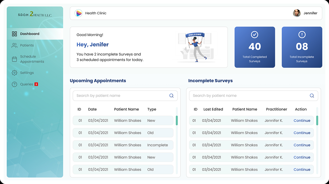
Practitioner
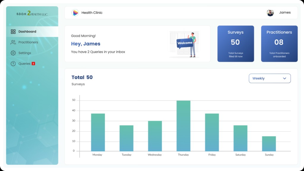
Admin
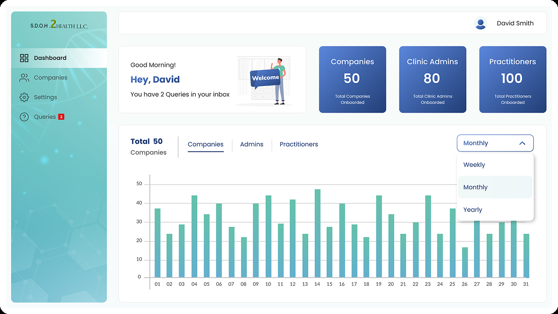
Super Admin
Core Practitioner Journey
Sign in → Workload → Patient → Assessment → Review → Report
The practitioner flow answers four questions Jennifer asks throughout her day — who, what, what do I have, and what needs attention.
Four questions the workflow must answer
The dashboard as external memory
Capture → Organise → Communicate
Three layers beyond the form
The product story moves from collecting social-health context to structuring it for reuse to sharing it with clinical teams.
Capture · Organise · Communicate
Three product layers that turn a survey into a usable clinical workflow.
01
Capture
Collect the patient's social-health context through a structured SDOH survey — income, employment, food security, housing, and living conditions.
Next →
02
Organise
Store and structure the information in patient records so it remains findable, reviewable, and connected to appointments and form status.
Next →
03
Communicate
Turn captured information into reports and snapshots that can be shared with doctors — connecting social context to treatment decisions.
Wireframes
Structure before visual refinement
Wireframes tested whether Jennifer could find patients, start assessments, track incomplete work, and move information toward reporting — before investing in visual polish.
High-fidelity wireframe exploration
The wireframing phase asked: Can Jennifer find the right patient? Does she know where to start? Can she identify incomplete work and return to unfinished assessments?
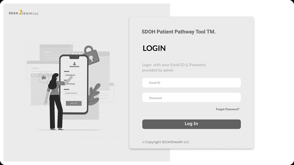
Sign in
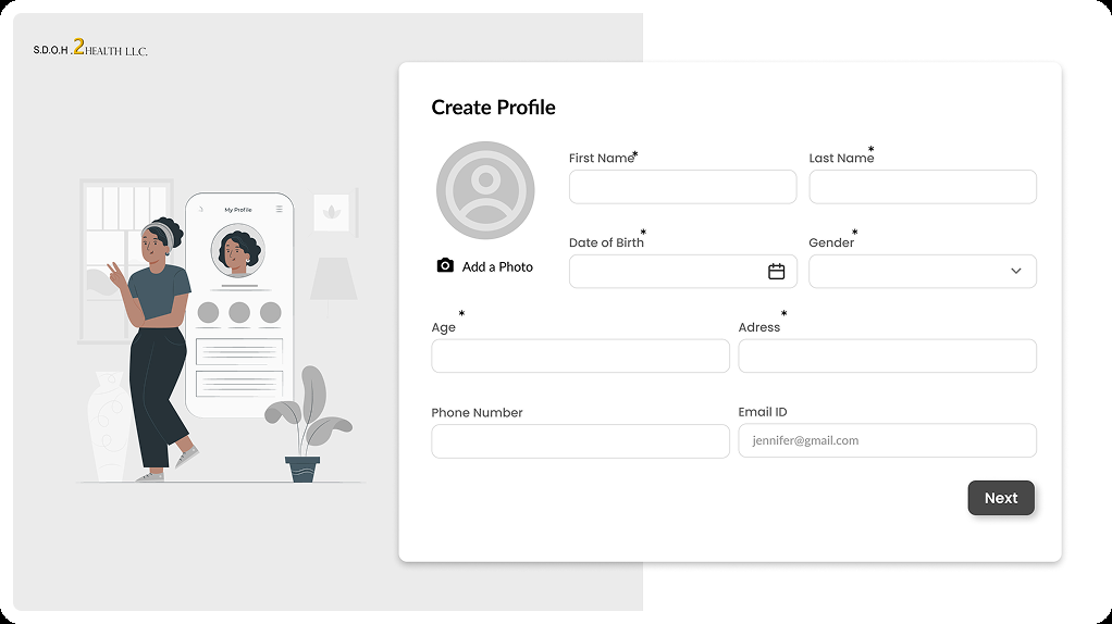
Create profile
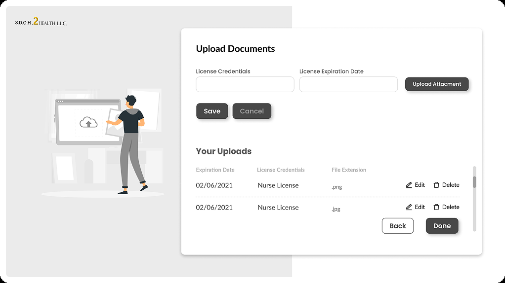
Upload documents
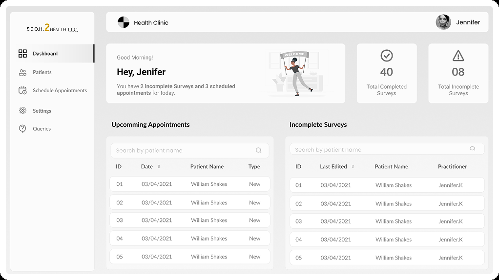
Dashboard
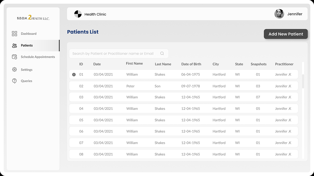
Patients list
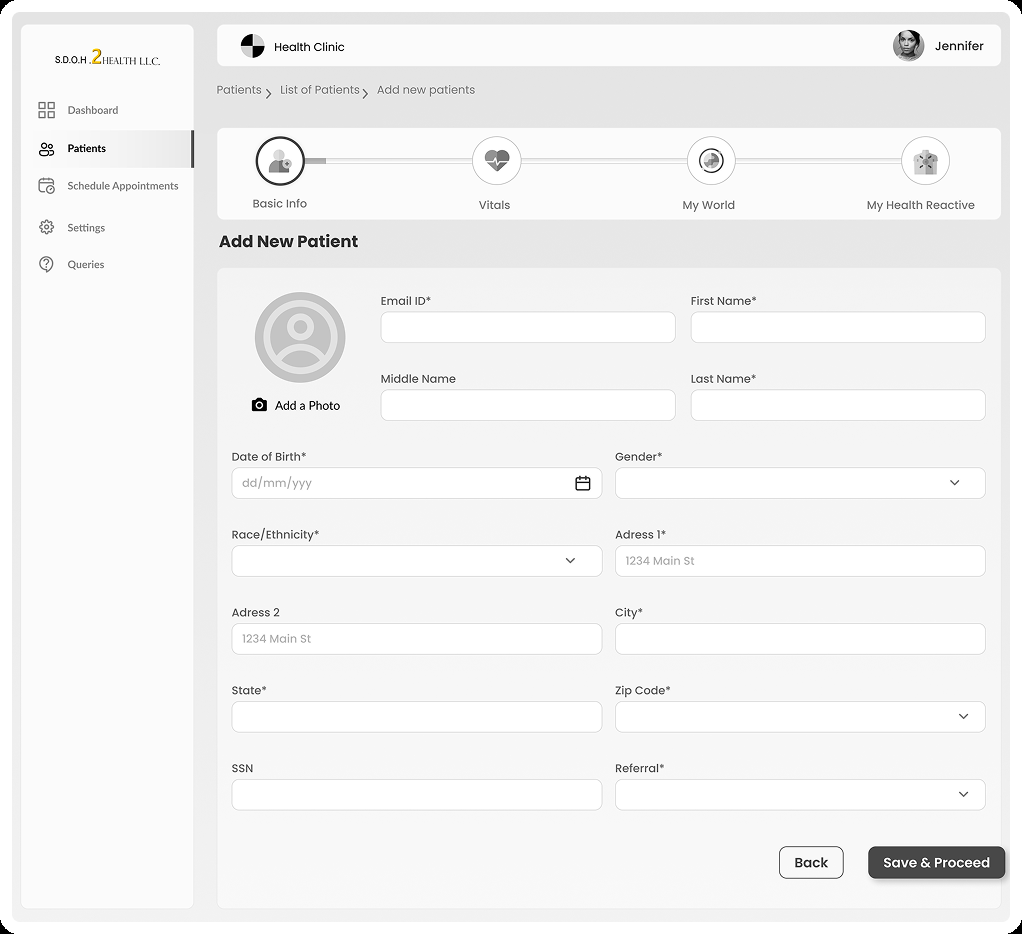
Add new patient
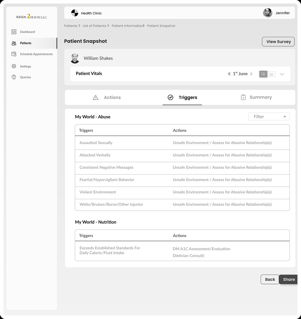
Patient snapshot
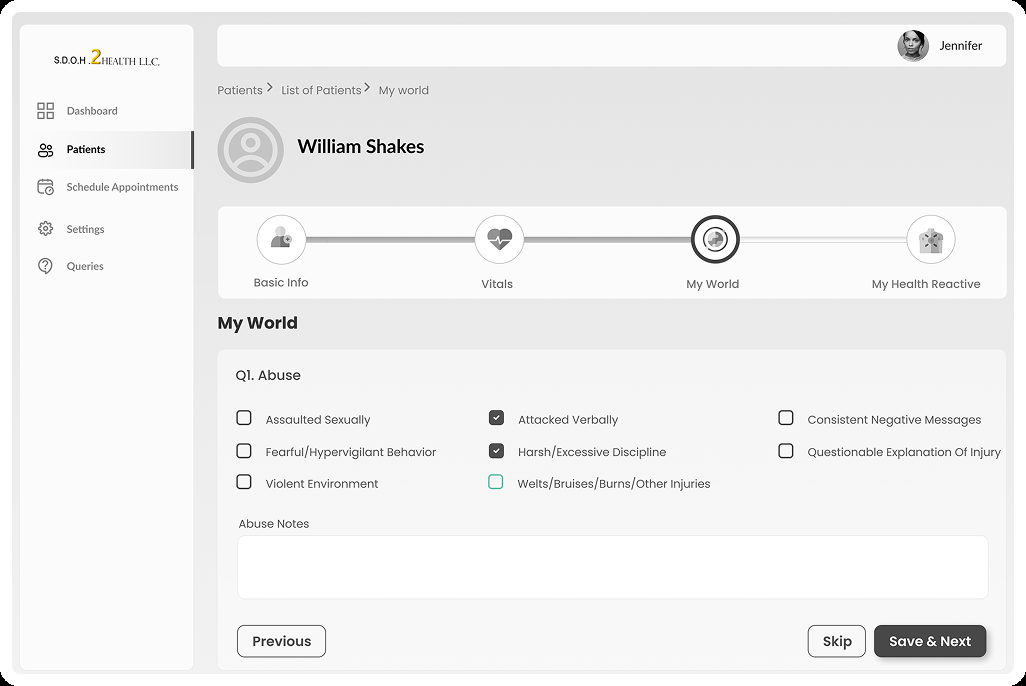
SDOH form
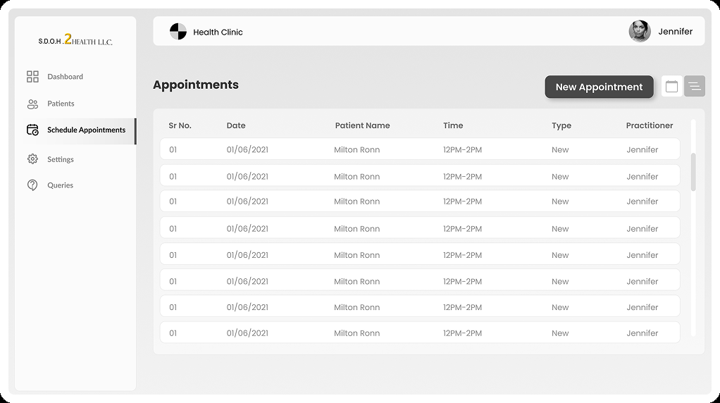
Appointments list
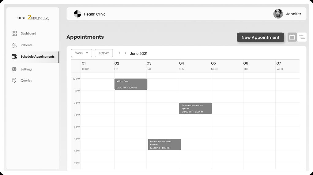
Appointments calendar
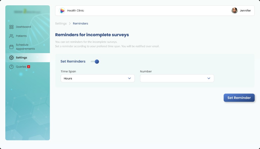
Reminders
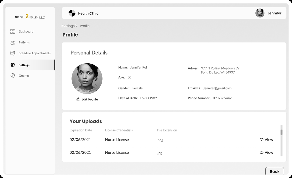
Profile
Key UX Decisions
Five decisions that shape the workflow
Each decision connects a practitioner friction to a specific design response — framed as expected value, not measured outcomes.
Centralise patient information
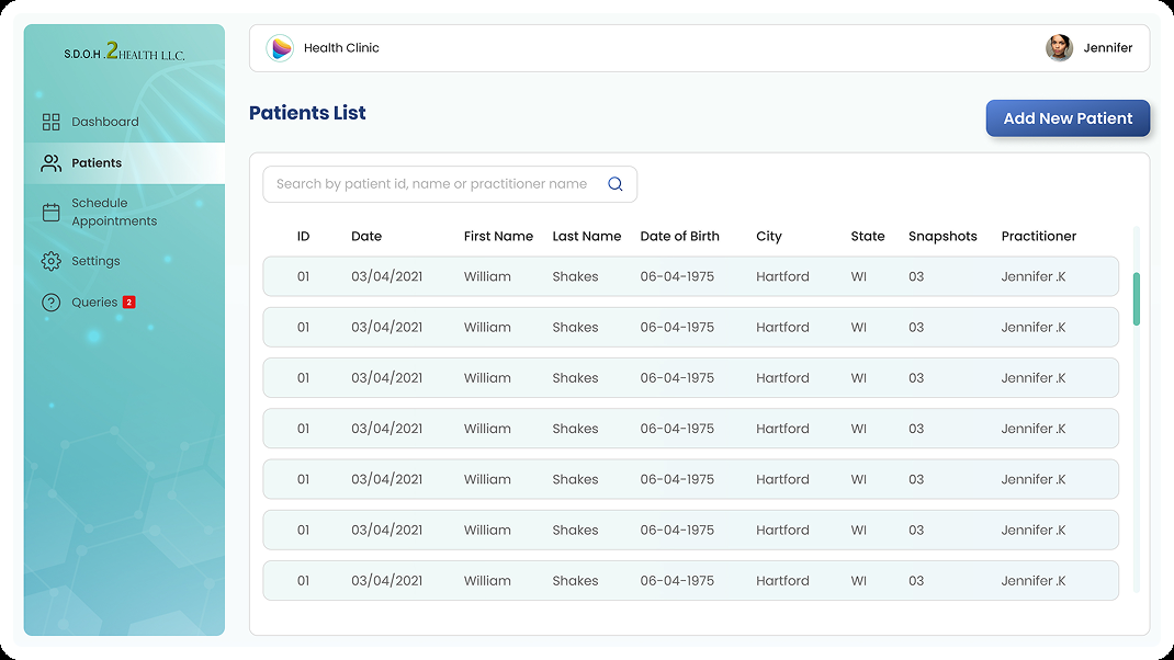
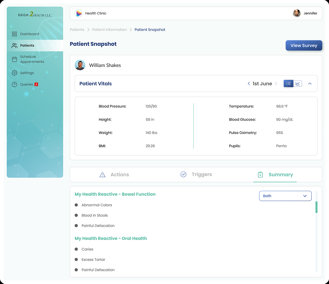
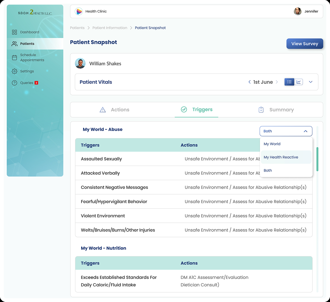
A structured digital patient experience — directory, intake, and snapshot — keeps patient context in one place. Jennifer can search patients, add new records, and review triggers and actions without switching systems.
Surface completion status
The dashboard and patient views make completed and incomplete work visible at a glance. Form progress becomes part of the workload overview, not something Jennifer has to reconstruct from memory.
Make appointments visible
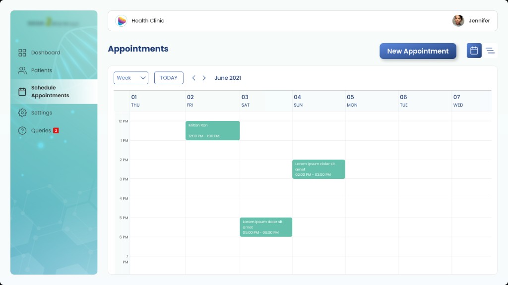
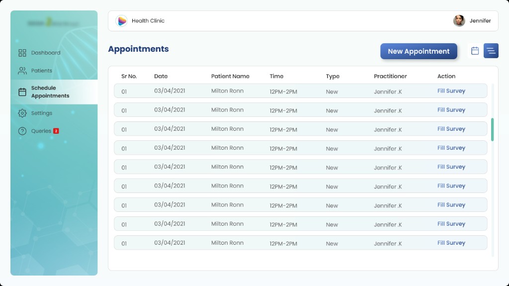
Upcoming appointments surface on the dashboard and in a dedicated scheduling view. Jennifer can see her week at a glance and receive reminders for scheduled form-filling sessions.
Structure the SDOH questionnaire
The digital form organises questions into a manageable workflow with clear sections and progress. Jennifer can move through the survey efficiently and return to incomplete sections later.
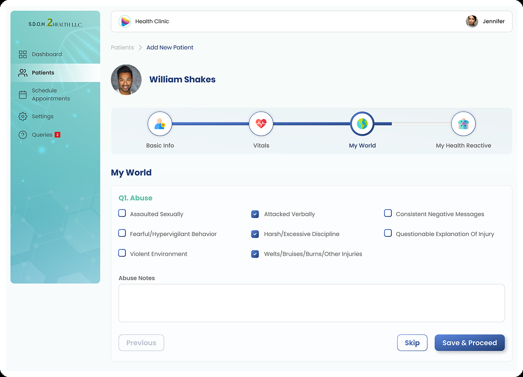
Patient details captured as
- 1.Basic information
- 2.Vitals
- 3.Surrounding information
- 4.Health reaction information
Connect forms to reporting
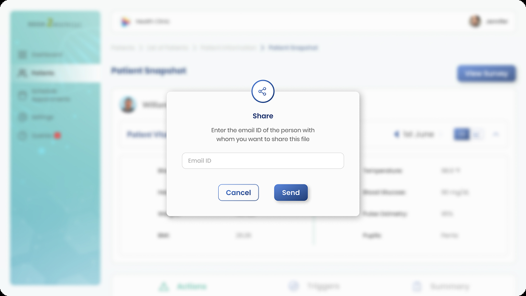
Patient snapshots and shareable reports connect survey responses to assessment and treatment information — making social context actionable beyond the initial form-filling session.
High-Fidelity Design
Screens grouped by what Jennifer is trying to do
The final UI is organised by user task — not by feature list — with each group tied to a specific moment in the practitioner workflow.
Help me get started
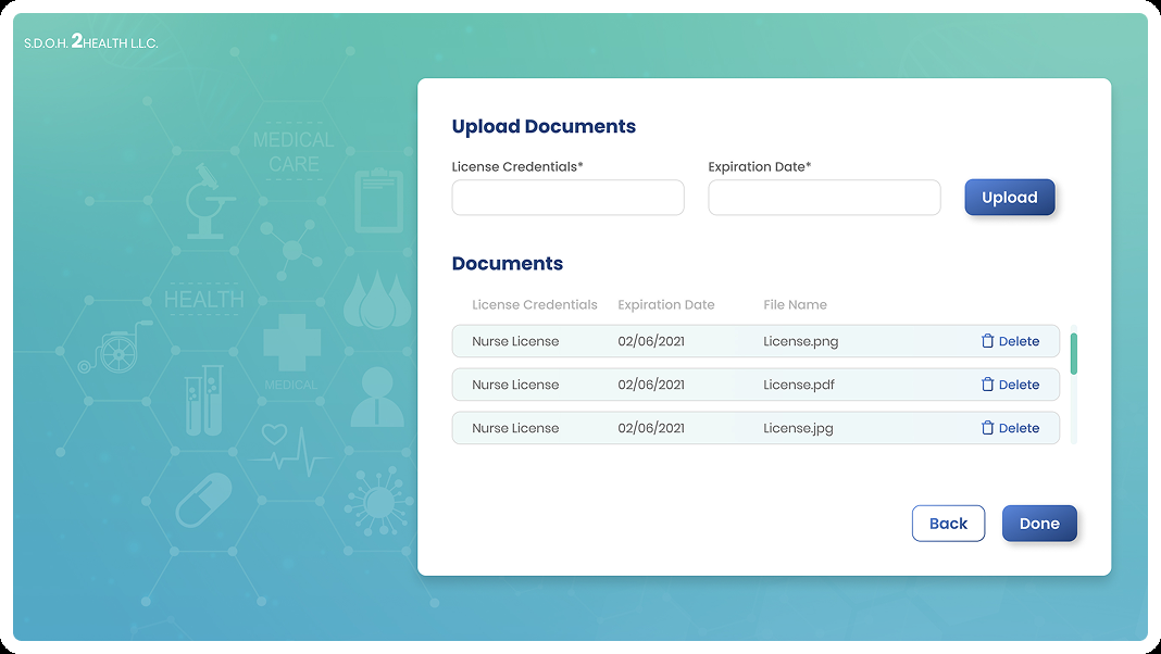
Sign-in and document onboarding from the final practitioner flow — establishing access before the clinical day begins.
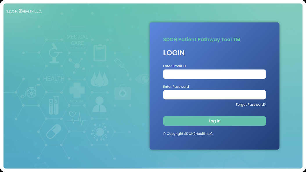
Sign in
Upload credentials
Help me manage my workload
- Personalised greeting with daily context
- Completed survey count at a glance
- Upcoming appointments and incomplete form queue
- Persistent navigation: Dashboard, Patients, Schedule, Settings

Help me manage a patient
From patient directory through snapshot review and scheduling — keeping patient context findable and actionable.
Find the right patient quickly
Review triggers and next actions
Calendar view
List view
Help me capture social-health information
- Organised sections across social determinants
- Progress visible throughout the survey
- Designed for in-person and phone-based collection
- Sensitive topics handled with clear language and appropriate tone

Help me communicate
Snapshots and share flows turn captured SDOH data into something clinicians can act on.
Patient snapshot
Share with the clinical team
Admin — clinic operations
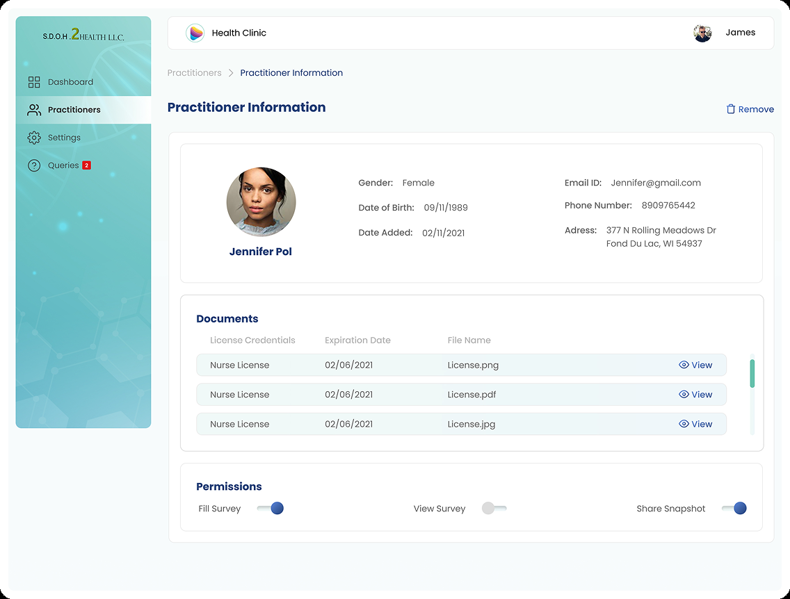
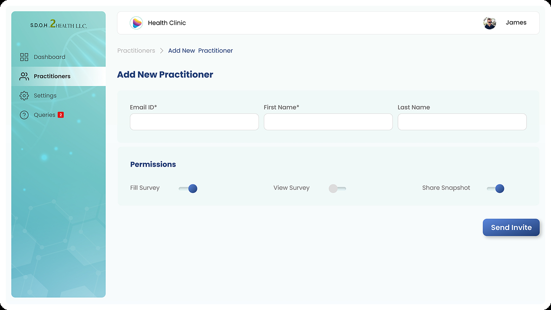
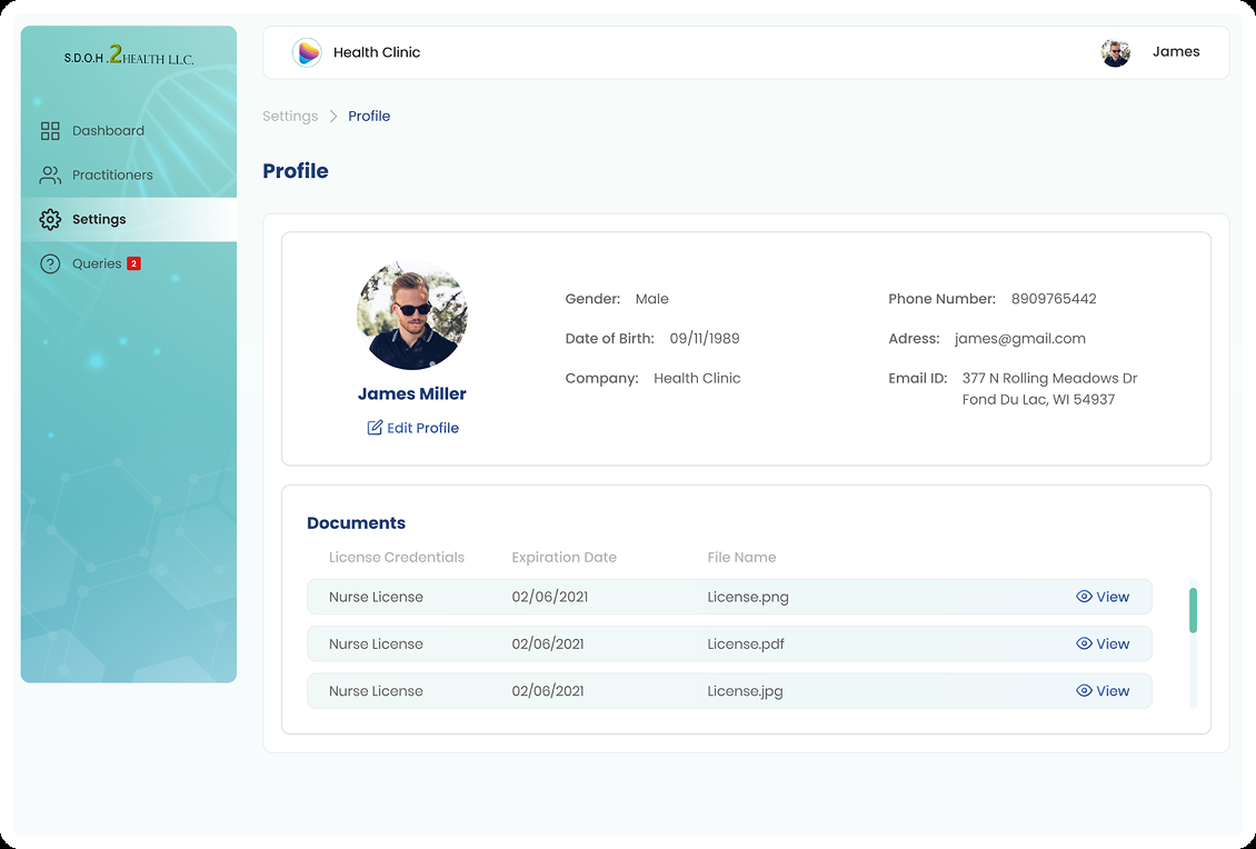
Admin surfaces from the Figma final designs — practitioner management, profile, security, and support.
Admin dashboard
Practitioner information
Add practitioner
Profile settings
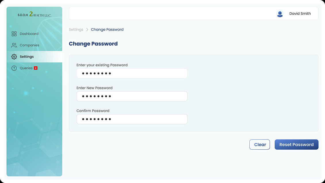
Account security
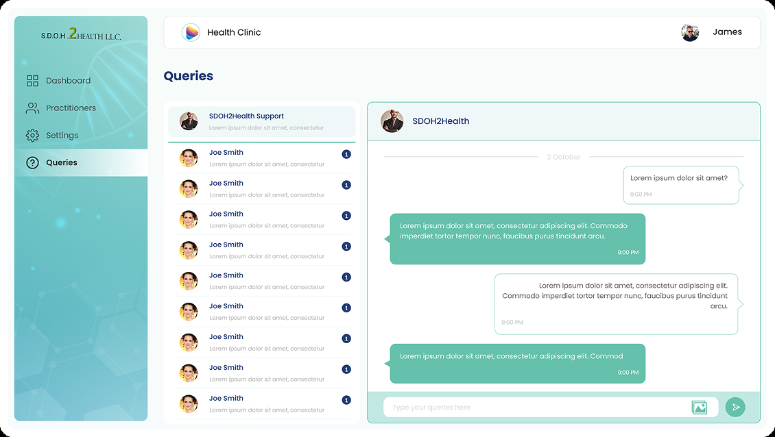
Queries / support
Super Admin — organisation control
Company-level administration kept separate from Jennifer's clinical day.
Super Admin dashboard
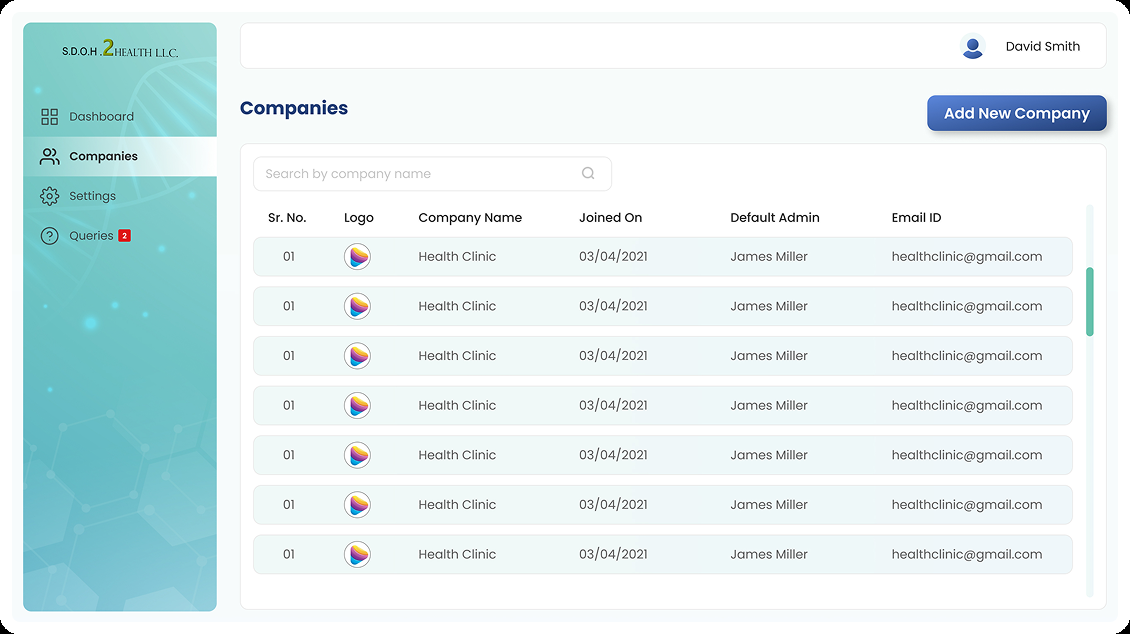
Companies
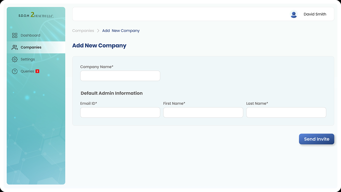
Add company
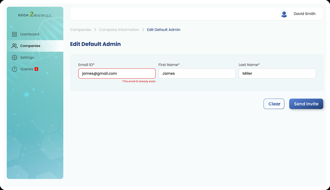
Edit default admin
Responsive Experience
Same workflow, different context
Jennifer may move between hospital, clinic, and home — using mobile, desktop, and tablet across her day.
Preserving hierarchy across screen sizes
The responsive experience should preserve core navigation, patient context, form progress, information hierarchy, and primary actions — while adapting density and interaction patterns to the available screen.
The source considers mobile, desktop/laptop, and iPad/tablet use. This represents a design direction to validate, not a claim of full responsive implementation across every screen.
- Core navigation remains consistent
- Patient context persists across contexts
- Form progress visible on any device
- Primary actions stay within easy reach
Accessibility & Sensitive Information
Design considerations for healthcare context
Because SDOH information can concern personal circumstances, privacy and appropriate access should be treated as first-class UX considerations.
Proposed design considerations — not compliance claims
What I Would Validate Next
Proposed usability testing — not measured results
The source material does not include usability-test metrics or clinical outcomes. These are proposed validation scenarios for a next phase.
Representative test scenarios
Usability Testing & Validation Measures
Behavioural measures
- Task completion rate
- Time to locate a patient
- Time to start an assessment
- Form completion errors
- Time to resume an incomplete form
- Time to identify upcoming appointments
- Number of interactions for key tasks
Qualitative signals
- Can Jennifer find the right patient quickly?
- Does she understand where to begin an assessment?
- Does form progress feel clear and manageable?
- Can she identify unfinished work without anxiety?
- Does the dashboard reduce cognitive load?
- User confidence and perceived ease of use
Future Opportunities
Beyond the initial workflow
These are future directions to explore — not features confirmed as implemented in the current design.
Where the concept could evolve
Exploratory directions for a next phase — not features confirmed in the current design.
Longitudinal patient context
Make previous SDOH assessments easier to review over time.
Trend visibility
Help practitioners understand how social circumstances change.
Referral support
Connect identified needs with relevant community services.
Better reporting
Create concise summaries for clinical teams.
Follow-up support
Remind practitioners about incomplete assessments or scheduled interactions.
Collaboration
Explore how information moves between practitioner, administrative, and clinical stakeholders.
Reflection
Making information manageable enough to be useful
The most important lesson: the difficult part is not collecting more information — it is making information manageable enough to be useful.
“SDOH Health is not simply a digital replacement for a paper questionnaire. It is an exploration of how UX can make complex social-health information easier for practitioners to capture, organise and communicate.”
Capture the human context. Organise the complexity. Make it useful.
The workflow is the product
The form is only one part of the experience. Patient management, appointments, form status, review, and reporting are what make SDOH capture useful in a real clinical day.
Progress visibility reduces cognitive load
Surfacing completed forms, incomplete work, and upcoming appointments on the dashboard acts as external memory — more valuable than notification badges alone.
Context must reach clinicians
SDOH data only creates value when it reaches doctors in an actionable form. Connecting capture to communication closes the loop between social context and treatment decisions.