The Challenge
When the battery gets low, every decision matters
Electric vehicles change the relationship between driving and energy. As the battery drops, the driver has to decide — conserve, continue, or charge — often while already running late and moving at speed.
Design an interaction, not another warning
“Design an in-vehicle interaction that makes a driver aware of a low-battery situation and enables them to activate a Power Saving Mode with minimal cognitive and physical effort while driving.”
Understanding the Problem
Low battery is not simply a percentage
A battery number on its own doesn't tell a driver what the situation means. Before sketching a screen, I mapped what a low state of charge actually changes across the vehicle.
What low battery actually changes
- Reduced available power and performance
- Reduced driving range as charge falls
- Reduced acceleration and top speed (RPM throttling)
- Limited air-conditioning and heating
- Restricted use of some vehicle functions
- Diminished safety margins — brakes, airbags, stability control
“The driver needs an actionable interpretation of battery status — not just a battery number.”
From “show low battery” to “help the driver decide”
Six stages from requirement to road-ready flow
Requirement Gathering
Competitive Analysis
Persona Development
Ideation
Wireframing
Final UI Design
A concept project, so the final stage is a validation plan rather than a shipped, tested product.
Research & Benchmarking
Learning from five EV brands
A competitive review looked at how existing EVs communicate low-battery and efficiency modes — naming, thresholds, and how many times they alert the driver.
Competitive Analysis
Conducted competitive analysis to understand how EV brands use their low-battery mode and its functions — naming, thresholds, alert behaviour, and which vehicle systems are affected.
| Pointers | Hyundai | Ford | MG | Chevrolet | BMW |
|---|---|---|---|---|---|
| Mode Name | ECO+ mode | ECO mode | ECO mode | LOW mode | ECO Pro mode |
| Icon |  |  | 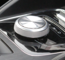 | — | 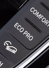 |
| Upfront low-battery mode button | |||||
| Acceleration is reduced | |||||
| Top speed is limited | |||||
| Air conditioning & heating systems are adjusted | |||||
| Extends range | |||||
| Driver is prompted to drive more efficiently | |||||
| Display alert | |||||
| Audible alert | |||||
| No. of alert | 1 | 2 | 1 | 1 | 2 |
| Alert percentage | 20% or less | 20% or less | 20% or less | 25% or less | 10% or less |
Hyundai
- Mode Name
- ECO+ mode
- Icon
- Upfront low-battery mode button
- Acceleration is reduced
- Top speed is limited
- Air conditioning & heating systems are adjusted
- Extends range
- Driver is prompted to drive more efficiently
- Display alert
- Audible alert
- No. of alert
- 1
- Alert percentage
- 20% or less
Ford
- Mode Name
- ECO mode
- Icon
- Upfront low-battery mode button
- Acceleration is reduced
- Top speed is limited
- Air conditioning & heating systems are adjusted
- Extends range
- Driver is prompted to drive more efficiently
- Display alert
- Audible alert
- No. of alert
- 2
- Alert percentage
- 20% or less
MG
- Mode Name
- ECO mode
- Icon
- Upfront low-battery mode button
- Acceleration is reduced
- Top speed is limited
- Air conditioning & heating systems are adjusted
- Extends range
- Driver is prompted to drive more efficiently
- Display alert
- Audible alert
- No. of alert
- 1
- Alert percentage
- 20% or less
Chevrolet
- Mode Name
- LOW mode
- Icon
- —
- Upfront low-battery mode button
- Acceleration is reduced
- Top speed is limited
- Air conditioning & heating systems are adjusted
- Extends range
- Driver is prompted to drive more efficiently
- Display alert
- Audible alert
- No. of alert
- 1
- Alert percentage
- 25% or less
BMW
- Mode Name
- ECO Pro mode
- Icon
- Upfront low-battery mode button
- Acceleration is reduced
- Top speed is limited
- Air conditioning & heating systems are adjusted
- Extends range
- Driver is prompted to drive more efficiently
- Display alert
- Audible alert
- No. of alert
- 2
- Alert percentage
- 10% or less
What the research suggested
Across the reviewed examples, efficiency modes shared the same ingredients — and the same gap.
A recognisable mode
Every brand exposes a named efficiency mode (ECO, ECO+, LOW), but drivers still have to know when and why to use it.
→ Surface the mode contextually, at the moment it becomes relevant, instead of hiding it in settings.
A visible system state
Modes reduce energy use, but the active state is often communicated weakly once enabled.
→ Make “Power Saving Mode is on” unmistakable and persistent on the dashboard.
A single low-battery notification
Most brands alert once at a fixed threshold, leaving little recovery time before the situation is critical.
→ Escalate in tiers rather than firing one late, high-stress warning.
Little connection to range
Alerts rarely explain the consequence — how far the car can still travel — so drivers can't judge urgency.
→ Tie the recommendation to estimated remaining range so the driver understands why it matters.
Defining the User
A driver who is already under pressure
A realistic commute scenario grounded every decision in the pressure of a real morning — not an idealised, unhurried driver.
Meet Raj — when a routine commute turns urgent

Raj is a 28-year-old IT engineer in Pune with a predictable ~40 km commute. One morning he forgets to charge and leaves with under 40% battery — already running late. He isn't thinking about EV technology; he's thinking about whether he'll make it.
preserve remaining battery, reach the office on time, know how far the car can travel
an early warning before critical, and charging stations along the route
no time to charge, and long flows while driving feel unsafe and frustrating
“The more urgent the driving situation becomes, the simpler the interaction needs to become.”
Reframing the Problem
From activating a feature to supporting a decision
The brief could be read as “build a way to turn on low-battery mode.” The persona pushed it somewhere more useful.
“How might we help a driver conserve energy and maintain confidence about reaching their destination — without increasing distraction?”
Three principles that guided the design
Explain the situation
Don't rely on a battery percentage alone. Communicate that the battery is low or draining quickly, in human terms.
Recommend an action
Surface Power Saving Mode when it is relevant, instead of making the driver search for it while driving.
Preserve confidence
Show estimated remaining range and provide a path to nearby charging stations, so the driver never hits a dead end.
Ideation
Designing for the driver's next decision
Several interaction directions were explored, each trading off speed of access against how much the driver has to understand.
Four interaction directions
Each direction was weighed for how well it fits a moving-vehicle context.
Upfront control
Direct access to the efficiency mode. Fast — but relies on the driver knowing when and why to use it.
Contextual pop-up
A recommendation with a clear activation action. Discoverable and contextual — but can disrupt if overused.
Range-led recommendation
Pair the battery warning with estimated remaining range. Connects state to a real consequence — needs careful hierarchy.
Charging support
A direct route to nearby charging stations. A recovery path when conserving energy isn't enough — must stay secondary to driving.
Combine contextual alerts, one-step activation, range visibility, and charging support
The final concept blends all four — progressively communicating urgency instead of presenting one large warning, and always keeping the recommended action a single tap away.
Alert Strategy & Architecture
Escalate information, not interaction
The concept explores multiple battery states so the driver gets an appropriate level of information as the situation becomes more critical — while the interaction stays short.
Graduated urgency, one action
- Early warning (~30%): introduce the Power Saving recommendation while there is still time to act
- Critical warning (~20%): communicate that the battery is draining quickly and reinforce the action
- Confirmation: once activated, confirm the new state clearly
- Critical state: surface estimated remaining range and guide the driver toward charging
A five-level information hierarchy
The driver's primary decision stays at the top; supporting detail is revealed progressively.
Immediate status
Battery is low / draining quickly.
Consequence
Approximately how much range remains.
Recommended action
Turn on Power Saving Mode.
Recovery option
Find nearby charging stations.
System impact
Understand which vehicle functions are being limited or adjusted.
Wireframing
Testing the sequence before the visuals
Low-fidelity frames were used to test the flow — normal driving → low battery → recommendation → activation → confirmation → power-saving dashboard — before investing in visual design.
One primary action per state
The wireframe flow
The full low-battery sequence in greyscale, before any visual styling.
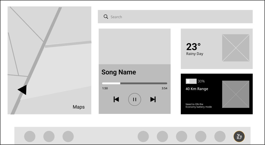
Low-battery dashboard — 30%, 40 km range
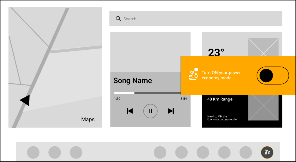
First alert — recommend Power Saving Mode
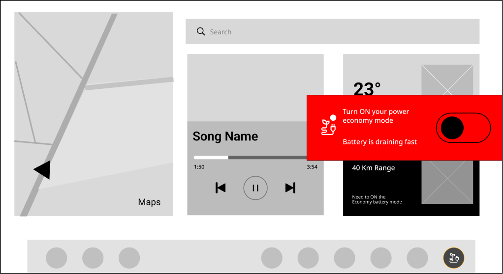
Critical alert — battery draining fast
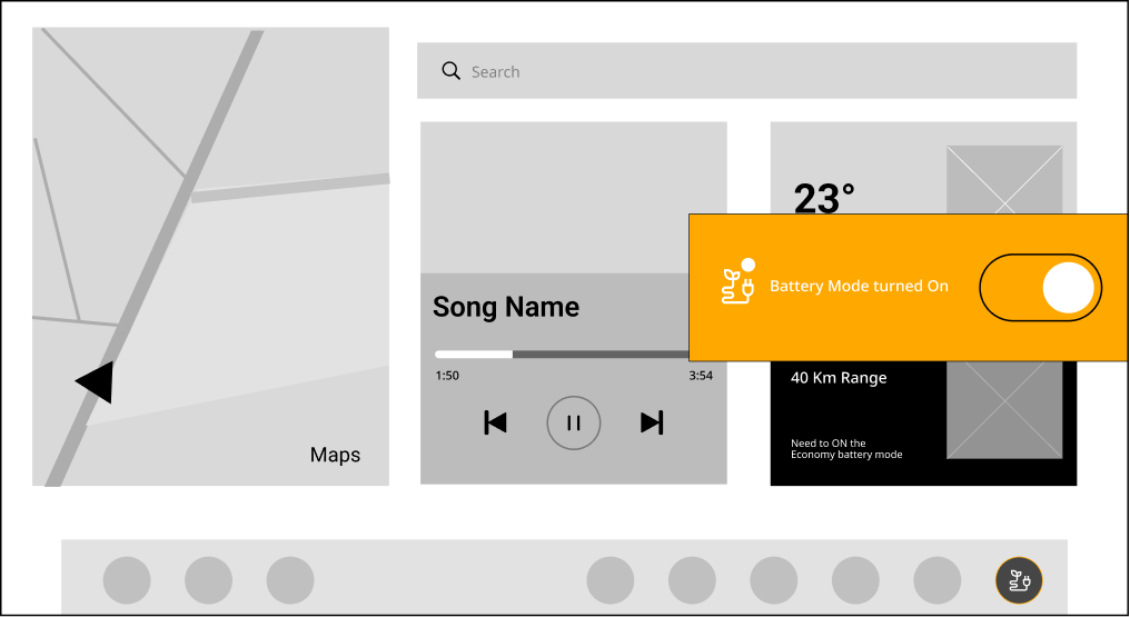
Confirmation — mode turned on
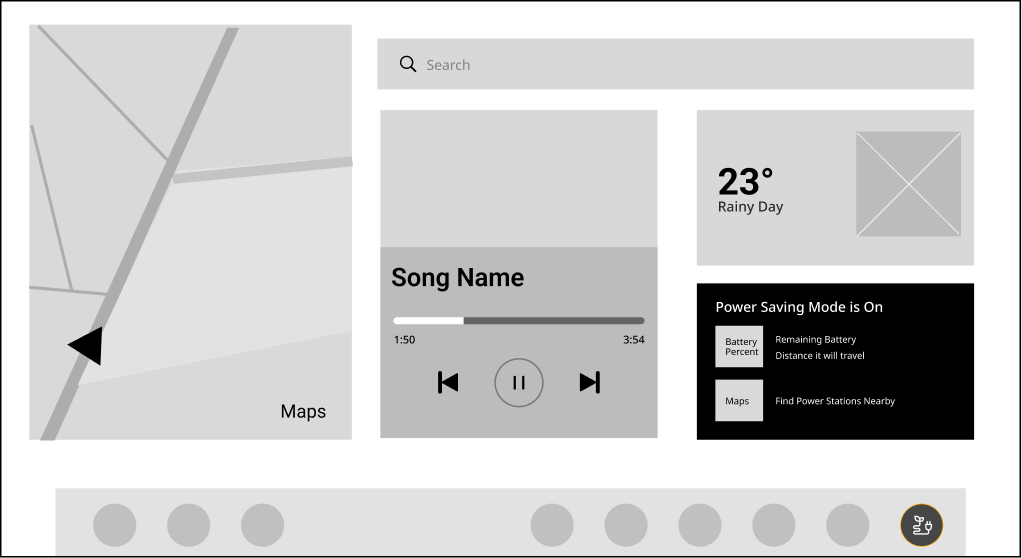
Power-saving dashboard — range + charging
Final UI
A low-distraction visual hierarchy
The final UI builds on the existing EV infotainment environment rather than introducing a separate experience — keeping the driver's most important decision visually dominant.
What the driver sees first
- Primary: battery state, remaining range, recommended action
- Secondary: navigation, weather, media, climate controls
- Tertiary: supporting system information
From awareness to assistance — step by step
The five states a driver moves through, and the reasoning behind each one.

Awareness
The low-battery state appears inside the normal driving context rather than on a separate screen, so the driver picks it up at a glance without leaving navigation or media.
- Battery percentage and estimated range shown together
- No interruption yet — awareness before escalation

First recommendation
At around 30% the system offers Power Saving Mode with a one-tap toggle. Surfacing it early gives the driver time to act before the situation turns critical.
- The action sits where the driver is already looking
- No trip into vehicle settings required

Critical warning
At around 20% the tone escalates to red and states that the battery is draining quickly — but the interaction itself does not get harder. The action stays exactly the same single tap.
- Urgency escalates through colour and wording, not more steps
- Escalate information, not interaction

Confirmation
Once activated, the system confirms the new state so there is no ambiguity about whether the mode is on — closing the loop without an extra confirmation dialog.
- Removes doubt that the action succeeded
- No additional tap to dismiss a modal

Assistance
The dashboard now shifts from warning to helping: Power Saving Mode is visibly on, remaining range is front and centre, and charging stations are one tap away.
- Remaining battery and distance the car can travel
- Locate charge points without leaving the drive context
Make the recommended action more prominent than the supporting information
The activation toggle is the visual focus of each alert, while range and status stay quietly in view — so the safe action is always the obvious one.
Safety Considerations
Safety was a design constraint, not a checklist
Because the interaction happens while driving, the design worked to minimise interaction steps, reading time, text density, decision complexity, and the need for precise touch.
Six safety-first rules
Prioritise glanceability
The most important information should be understood in a single glance.
One primary action
Avoid presenting several competing calls to action in any state.
Progressive disclosure
Expose detailed information only when it is actually required.
Auditory reinforcement
Use audible alerts to supplement visual notifications when appropriate.
Avoid unnecessary confirmation
Don't add steps when the system can safely communicate state directly.
Keep navigation available
Charging support stays reachable without forcing the driver through unrelated settings.
“A real vehicle implementation would need validation against automotive HMI, driver-distraction, functional-safety, and human-factors requirements.”
Outcome & Next Steps
From warning to assistance
The concept turns a potentially stressful low-battery situation into a guided sequence — and sets up what to validate next.
The core interaction model
What I'd validate next
As a concept, the next phase is validation rather than assuming the design is complete.
Right information, right moment, least effort
Not more information — the right information
In a moving vehicle, good UX isn't about giving the driver more. It's about giving them the right information at the right moment with the least possible effort.
Feature-first to driver-first
The biggest shift was moving from “how do we turn on battery saver?” to “what does the driver need to know and do when energy becomes uncertain?” That reframe shaped everything downstream.
Urgency demands simplicity
The more critical the moment, the simpler the interaction had to become — a single, obvious action the driver could take without looking away for long.